You may have come across a website where, when you scroll, the background moves slower than the foreground elements, creating an almost cinematic depth. This effect in web development is known as the parallax scrolling.
As a web developer, when I first saw the parallax scrolling effect, I was instantly hooked. I had to learn how to implement this effect myself. My first attempt? Not so great. But with time, through trial and error, I discovered the best ways to add parallax scrolling without sacrificing speed.
If you're like me, someone who loves adding visually engaging elements without slowing down your site, this guide will help you achieve that balance. I’ll share different methods to implement parallax scrolling, share the pros and cons of each, and highlight best practices I’ve learned from real-world projects.
Table of Contents
- What is Parallax Scrolling?
- Why use parallax scrolling?
- How to Create Parallax Scrolling in CSS & HTML
- How to Do Parallax Scrolling in WordPress
- How to Add Parallax Scrolling to a Single WordPress Page
- Excellent Parallax Scrolling Examples
- Parallax Scrolling Best Practices
- How to Get the Best Out of Parallax Scrolling
What is Parallax Scrolling?
Parallax scrolling is a visual effect where the background of a web page appears to stay still while the foreground shifts vertically or horizontally. Parallax scrolling is used to add visual interest to a website and engage users as they scroll through a web page.
In a parallax scrolling effect, both the foreground and background are moving, but the background typically moves much more slowly, giving the illusion of depth. Done correctly, parallax scrolling produces a seamless virtual experience.
Here are some things I consider whenever I want to add a parallax scrolling effect to my website.
- Using it selectively. Parallax scrolling is much more powerful when I use it on one particular element as opposed to all my pages. I use it in headers and titles, or sometimes maybe just on my home page. I want parallax scrolling to strengthen my website’s design, not distract users.
- Image compression is key. Parallax scrolling uses a variety of media files and CSS shapes to create a sense of depth. I wouldn't want to compromise my web performance and user experience with large image files that load too slowly, so I prioritize image compression.
- Playing with color. Parallax scrolling isn’t just about the images in the foreground and background, but also about color. I might use more desaturated tones in the background and more lively colors in the foreground to create an even greater sense of depth.
Though there are several approaches to achieving a parallax scrolling effect, making the background move slower than the foreground is by far the most popular.
A slower-moving background embodies the same feeling as when you’re inside a moving vehicle looking out: The sky and clouds in the background appear to move at a slower pace than the trees and houses in the foreground.

Free Guide: 25 HTML & CSS Coding Hacks
Tangible tips and coding templates from experts to help you code better and faster.
- Coding to Convention
- Being Browser-Friendly
- Minimizing Bugs
- Optimizing Performance
Download Free
All fields are required.

You're all set!
Click this link to access this resource at any time.
Why use parallax scrolling?
I have come to realize the parallax scrolling effect isn’t just eye candy. When used intentionally, it solves real problems. Here’s why I recommend it for modern web projects.
1. It captivates users and keeps them scrolling.
According to a research by Samba Recovery, the average adult internet user's attention span is 8.25 seconds, influenced by the increasing distractions on the internet, social media, and the environment. In that time, I can lose a potential client or website visitor.
This means I have a very short amount of time to capture and hold visitors' attention. The parallax scrolling effect can help, as it turns passive scrolling into an interactive journey.
2. Storytelling becomes immersive.
Using the parallax scrolling effect, I can layer images and text to create a seamless, scrolling narrative that feels immersive — almost like flipping through an animated book.
Let's say I have a business and want to showcase my journey. With the parallax scrolling effect, I can tug at emotion and create a great experience.
3. You can modernize your site’s aesthetic.
I have noticed a pattern in modern website design. Modern websites are much more intuitive, creating an engaging user experience. The parallax scrolling effect plays right into this pattern, adding a modern and premium feel to websites.
Flat website designs can feel stale. Parallax scrolling can create a sleek and polished experience. It gives this high-end, cutting-edge feel without requiring complex animations. Plus, it helps highlight and draw attention to sections of our website.
Let’s take a look at this effect in play.
How to Create Parallax Scrolling in CSS & HTML
Are you inspired to take your website to the next level with parallax scrolling? Even thought the effect may seem difficult to create, you can use CSS and HTML to create this animation.
While there are several methods, the most straightforward approach involves using a container element to set a particular height for a background image.
But, before I dive into the first methods of creating a parallax scrolling effect, I recommend that you check out these free coding templates from our team at 探花精选. You can simply adjust the templates as needed, copy them into your CMS, and you're on your way.
Method 1: Basic Parallax Scrolling Effect with background-attachment: fixed (Simplest Method)
The simplest way to create a parallax scrolling effect is to have a fixed background. From there, you can have another component move over the background to create the parallax scrolling effect.
To create the parallax scrolling effect, I’ll need the background-attachment: fixed element in CSS. Other background properties can help me add additional styling, such as centering and scaling the background.
Here's a basic CSS code snippet for creating a parallax effect using background-attachment: fixed:
See the Pen by Clinton Joy () on .
In the codepen above, .parallax-container class creates the parallax effect. Here is a breakdown of the most important parts:
- background-attachment: fixed; The fixed value makes the background image stay in place while the page content scrolls. This creates the illusion that the content is moving over the image, rather than the image scrolling with it.

- height: 100vh; This ensures that each of my parallax sections takes up the full viewport height, making the effect more pronounced. It ensures that each parallax section takes up the full viewport height, making the effect more pronounced.
- background: center/cover no-repeat; In the image above you will see the center and cover values. I use these values to ensure the focal point of the image is always centered. The cover makes sure the image scales proportionally to cover the entire section, preventing unwanted empty spaces.
- display: flex; align-items: center; justify-content: center; These properties and values are just extra code I use, but they are very important to ensure that the text inside the parallax section is perfectly centered, making it look visually appealing.

Pros and Cons of the Basic Parallax Effect with background-attachment: fixed
Using the background-attachment : fixed; method to create the parallax effect is simple. The result is visually appealing and performs smoothly on desktop. On the other hand, this method doesn't work well on mobile devices. You may can cause the image to stay static rather than creating the parallax effect on phones.
Method 2: Parallax with CSS Transform and Perspective
The are two CSS properties that provide a smoother way to create a parallax scrolling effect. Instead of using background-attachment: fixed, in this method I will leverage CSS 3D transforms to create depth and movement in my parallax scrolling effect.
To achieve this, I’ll use the perspective property along with translateZ() and scale() to position elements in 3D space, creating a more realistic scrolling effect.
Here’s a basic example using CSS transform and perspective:
See the Pen by Clinton Joy () on .
In the example, the parallax effect is achieved using the .wrapper, .background, and header classes. Here’s a breakdown of the most important parts:
- .wrapper class (creating perspective) — perspective: 10px; I use this to create a 3D depth effect, making elements closer (translateZ(positive)) appear larger and elements farther away (translateZ(negative)) appear smaller. overflow-y: auto; enables scrolling within the wrapper, allowing the parallax effect to take place.

- header element (3D layering) — In the header, I have the transform-style: preserve-3d; which maintains the 3D effect so that child elements (like .background) respond correctly to translateZ(). z-index: -1; places the header behind other elements.

- .background Image (applying depth & scale) — translateZ(-10px); moves the background farther away in the 3D space, making it appear smaller. And then, with scale(2); I enlarge the background back to its original size, maintaining visibility and preventing gaps.

Pros and Cons of Parallax with CSS Transform and Perspective
CSS transform and perspective give a super smooth performance and better compatibility with modern browsers. But, a solid understanding of the 3D transforms, scaling, and perspective adjustments is needed for a natural effect. Otherwise, you may spend hours trying to get the job done.

Free Guide: 25 HTML & CSS Coding Hacks
Tangible tips and coding templates from experts to help you code better and faster.
- Coding to Convention
- Being Browser-Friendly
- Minimizing Bugs
- Optimizing Performance
Download Free
All fields are required.

You're all set!
Click this link to access this resource at any time.
Method 3: Advanced Parallax scrolling with Javascript
I can also create a dynamic parallax scrolling effect with Javascript. However, this method is advanced and requires you to know the .
This method involves dynamically updating the background position on the user’s scroll movement. Instead of relying solely on CSS, I use JavaScript to move the background speed differentsfrom than the foreground content, creating a smooth and customizable parallax effect.
This method offers me greater flexibility and better performance across different screen sizes.
Here's a code example of a JavaScript-powered example of a parallax effect:
See the Pen by Clinton Joy () on .
Normally, background images scroll at the same speed as other elements. But by adjusting the translateY() dynamically with JavaScript, I set the background to move aspeed differentpfromthan the foreground content, which gives the parallax effect.
Important components that contribute to the parallax effect with Javascript are:
- Listening for scroll events. This ensures that the function runs every time the user scrolls, dynamically updating the effect in real time. Using the addEventListener, I listen for the scroll and run a function every time a scroll event happens.

- Getting the scroll position. window.scrollY fetches the current vertical scroll position, allowing me to calculate how much the background should move. This vertical scroll position is then stored in a variable, as I will be using it later to apply the parallax scrolling effect.

- Applying the Parallax Effect. I use the transform: translateY() property to move the background slower than the foreground content, creating the depth illusion. The factor 0.3 determines how much the background moves relative to the scroll speed. A lower value makes the effect more subtle, while a higher value makes it more dramatic.

Pros and Cons of the Advanced Parallax Scrolling Effect with JavaScript
Unlike background-attachment: fixed, which often breaks on mobile devices, JavaScript can implement alternative scrolling behaviors that work across all screens. With JavaScript, customization can be done more precisely. However, the increased complexity might be an issue for beginners.
As a web developer, my go-to method to implement the parallax scrolling effect is totally dependent on my project and what I wish to achieve. For simple hero sections I can choose to go with the background-attachment: fixed, for a 3D-like effect: CSS transforms & perspective, and lastly, if I need to have full control, a JavaScript-based parallax scrolling effect.
How to Do Parallax Scrolling in WordPress
Parallax scrolling effects in WP can be created in multiple ways. I can either code my new parallax section into my website, install a free parallax scrolling theme , or install a dedicated plugin.
One of the things I like about WordPress is that it’s highly customizable and flexible. Each of these options will get me a similar, if not identical, result.
In order to have utmost flexibility, I recommend going with HTML and CSS. I can finetune my code without needing to switch to another theme or install a plugin that may slow down my site.
1. Add parallax scrolling using CSS and HTML.
If I want to add a parallax scrolling effect to all of my pages, there’s a simple, hassle-free way I use to do it through CSS and HTML. Before using this method, be sure that you’re comfortable editing theme files in WordPress.
To add parallax scrolling to my WordPress website, I will navigate to my theme editor by clicking Appearance > Theme Editor in my admin sidebar. Under Theme Files, I find the file for the section where I’d like to add a parallax scrolling effect. Then, I can proceed with adding my HTML for the parallax scrolling effect.
In case I am using an image to add the scrolling effect, I will need to upload my parallax background image to my WP media library.
Lastly, I will add the parallax CSS into my website code by going to Appearance > Customize > Additional CSS.
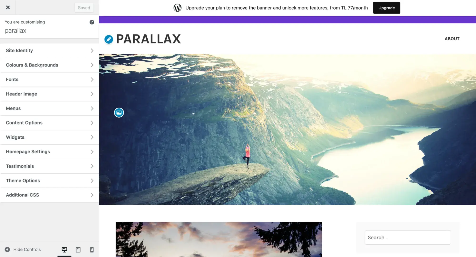
2. Install a parallax scrolling theme.
Not into coding? Installing a parallax scrolling theme is one of the easiest and simplest ways to add a parallax scrolling effect to a WP website.
These themes come with built-in parallax functionality, which makes it easy to add and remove the effect from a website.
3. Install a background parallax plugin.
If I don’t want to install a new theme entirely, I can install a plugin such as and .
These two plugins add a parallax effect to a site after adding a simple shortcode to the content. They’re compatible with major WP page builders such as WPBakery and Elementor.

Free Guide: 25 HTML & CSS Coding Hacks
Tangible tips and coding templates from experts to help you code better and faster.
- Coding to Convention
- Being Browser-Friendly
- Minimizing Bugs
- Optimizing Performance
Download Free
All fields are required.

You're all set!
Click this link to access this resource at any time.
How to Add Parallax Scrolling to a Single WordPress Page
I might want to add parallax scrolling to a single page. If I use a plugin, I can add a shortcode to the individual page’s content. In the case of a parallax theme, I’ll be able to toggle parallax options on a page-by-page basis. If I decide to use HTML & CSS, the steps are nearly identical to item one above, only I won’t edit my theme files.
To do this, first, I will navigate to the page I want to edit by clicking Pages > All Pages on my admin sidebar.
Next, switch from the visual editor to the code editor. On Gutenberg, I found this option by clicking the three dots in the top right corner, navigating down to Editor, and clicking Code Editor.
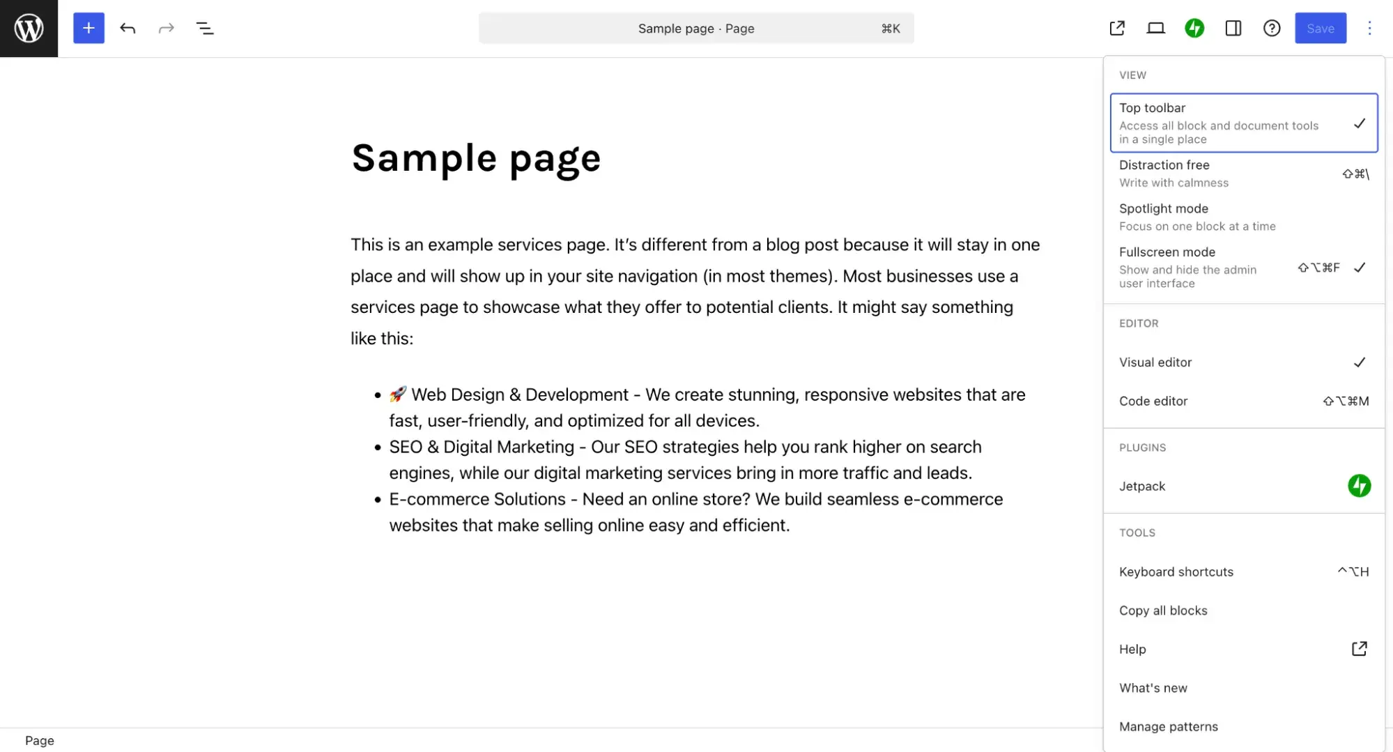
Other page builders will look a little different, but they’ll always offer the option of switching to a code editor. After I switch to the code editor, here is how my page looks:
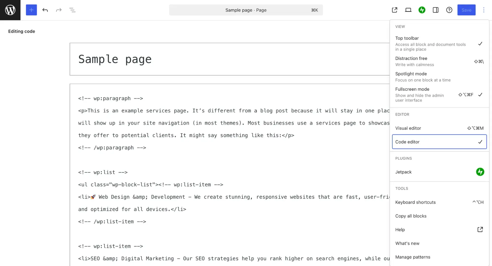
Now I can choose where I want to add a parallax scrolling section and add it. After that, I upload my background image to my media library and add the CSS to my website using the same steps listed above.
Excellent Parallax Scrolling Examples
Websites with parallax scrolling are incredibly engaging, imaginative, and often tell a story. Here are some of my favorite examples via :
1.
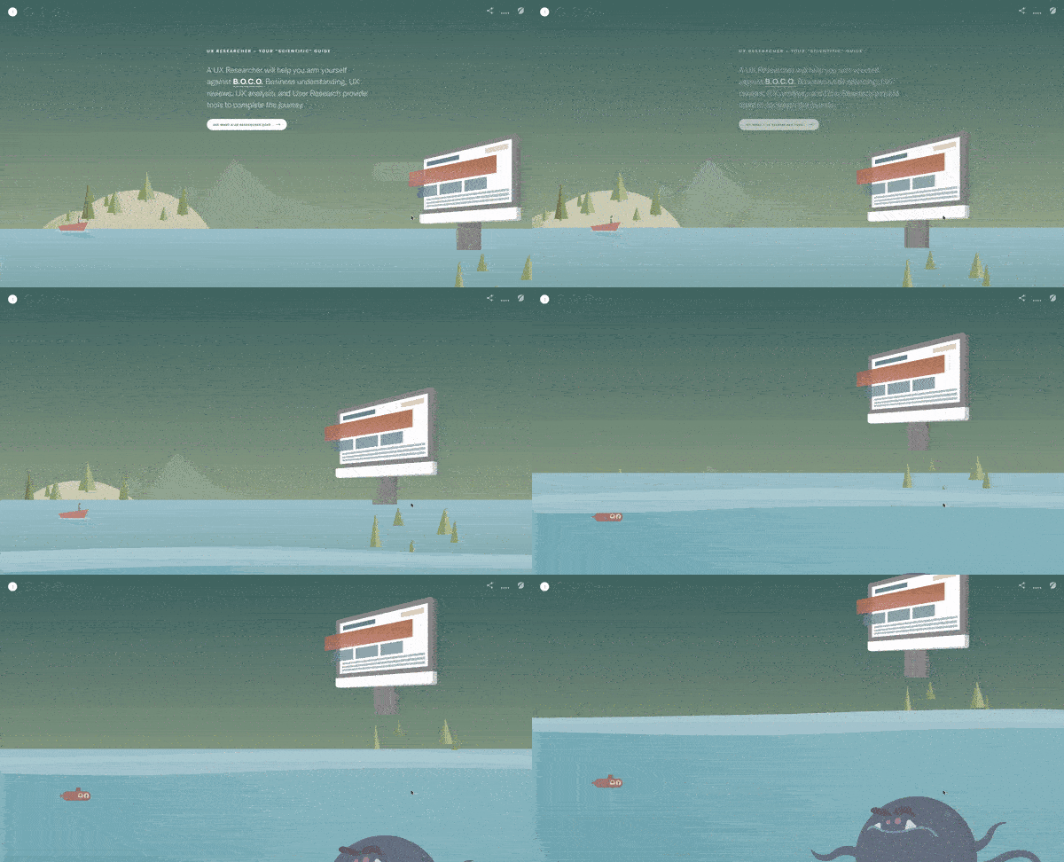
In their project titled “Defeat B.O.C.O,” the creative team takes me on a journey with a horizontal parallax scrolling design that also incorporates a vertical slide.
As I move through the page, I’m effectively taken below the surface of the sea and invited to learn more about the UX design process. It’s a strong example because of its elegant storytelling, engaging visuals, and quirky animations.
You should create a similar effect if you want to tell a story or present “boring” information in a more interactive format. For instance, the page provides information boxes with a plus sign. If you’re interested in learning more, you can expand the box, but if not, you can keep scrollingInAt the end, you’re prompted tn contach the Fresh Consulting team for a project.
Takeaways
- Use both horizontal and vertical movement to engage users.
- Don’t bog down the page with tons of text; if necessary, add a box you can expand for more information.
- Include a call-to-action at the end of the page.
2.
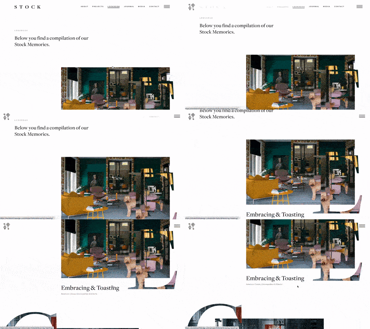
Stock Dutch Design, a design studio, uses clever parallax elements to bring attention to its website’s typography. Each letter has a photo that moves subtly when I scroll, and the images do, too. The most important descriptor for this example is “subtle” — I know that the parallax scrolling effect is there, but the attention remains on the firm’s fine interior design work.
Another item of note? The website liberally uses this effect on all of its pages, but because the effect is so subtle, it never feels overwhelming. In fact, it enhances the company’s brand identity and highlights its past projects. It’s almost as if the website is as much a work of art as the firm’s design work.
Takeaways
- Use the parallax scrolling effect to highlight your offerings or past work.
- Use the effect liberally throughout your website, but be sure to keep it subtle.
- Mix parallax scrolling with strong typography to make your website design stand out.
3.

Delassus Group, a grower of produce, uses a parallax scrolling effect to highlight one of its offerings: tomatoes. It not only uses fun graphics to make the parallax effect “pop,” but it also uses typographic elements just like Stock Dutch Design. I also love how Delassus Group doesn’t try to overly complicate the design — the brand uses solid colors and simple shapes to convey its message and bring attention to its products.
Like in the Defeat B.O.C.O example, the brand ends the page with a call-to-action and includes links to its other pages. And the best part? The other links also follow the same theme as the rest of the page. You get a sense that the other pages will also have the same fun parallax effect. (Spoiler: They do.)
Takeaways
- Include a call-to-action at the end of the page.
- Use solid colors, typography, and simple shapes to make your design pop.
- If you’re including additional links at the end of the page, make sure they follow the same theme as the rest of the page.
4.
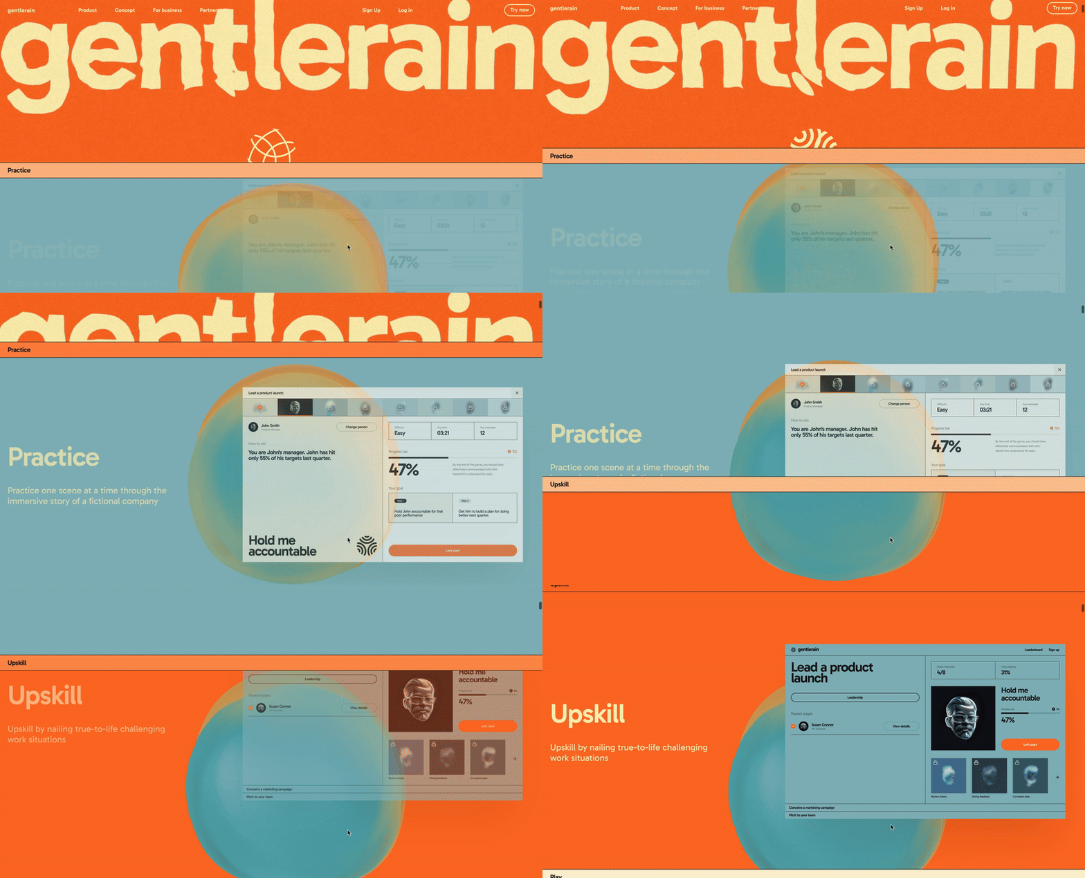
Gentlerain incorporates an extremely subtle parallax effect that smoothly transitions from the header, which has a beautiful watery effect, to the main content of its homepage. It’s so outstanding that it cannot go unnoticed at first glance, and that’s the beauty of a well-executed parallax effect — it can be both flashy and effective.
Interestingly, the brand doesn’t rely only on images for its parallax effect. Instead, it uses headings that can be both mobile and fixed in a place depending on what scroll position a viewer is in.
This demonstrates that parallax scrolling isn’t limited to images — you can achieve the effect with text as well. At the bottom of the page, Gentlerain also shows us that the parallax effect can also be done horizontally as it can be done vertically.

Free Guide: 25 HTML & CSS Coding Hacks
Tangible tips and coding templates from experts to help you code better and faster.
- Coding to Convention
- Being Browser-Friendly
- Minimizing Bugs
- Optimizing Performance
Download Free
All fields are required.

You're all set!
Click this link to access this resource at any time.
Takeaways
- Parallax can be both subtle and eye-catching. A well-executed parallax effect, like Gentlerain’s, smoothly enhances the user experience without being overwhelming.
- Parallax isn’t just for images. Text elements, such as headings, can also be used creatively — remaining fixed or moving depending on scroll position to add depth and engagement.
- Parallax works in multiple directions. While vertical scrolling is common, horizontal parallax effects can also create a unique and dynamic browsing experience.
5.

Works.Studio uses a highly subtle parallax effect to take me from the heading to the body of its home page. It’s so subtle that it’s easy to miss if you don’t look closely, but remember, the best parallax effects don’t have to be “in your face.” As shown in this example, you can still leverage parallax effects without going overboard.
The brand doesn’t even use images for its parallax effect, but rather headings. The headings don’t scroll with the page,;instead ,sthey stayin their position as I scroll upward. This shows that you don’t even need images to take advantage of this effect. At the bottom, Works.Studio skips adding parallax scrolling, instead preferring to leave their portfolio untouched.
Takeaways
- Keep your parallax effects subtle by using it on the headers as opposed to the images.
- Use color to transition from one section to the next. Otherwise, the effect won’t be all that noticeable.
- Skip the parallax effects in the body of your webpage if you’d like to keep it as simple as possible.
6.

Award-winning creative agency ToyFight's website is subtly interactive thanks to parallax scrolling features. The resulting 3D effect is powerful and certainly increases engagement, because it’s not only present as I scroll, but also as you click from page to page. That makes it easy for users to be delighted as they navigate through the agency’s website.
At the end of every page, the website includes a hand with a “rock on” sign and delightful background effects that make it seem like the hand is popping out of the page. This strengthens ToyFight’s brand identity and gives credence to the claims it makes on its page. It does create exciting and meaningful experiences — that’s evident in its very website.
Takeaways
- Use parallax scrolling effects to emphasize the effectiveness of the work you do.
- Include something distinctive at the end of every page — a branded footer, graphic, or form.
- Let the graphics’ movements show the parallax effect in action.
7.
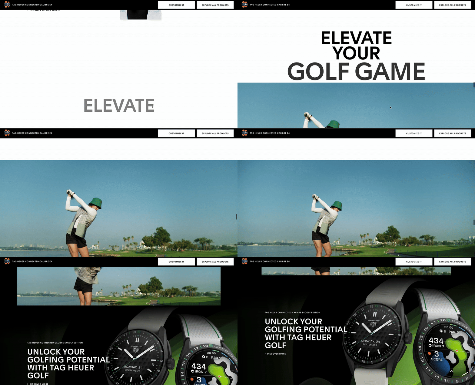
Parallax scrolling can also be used to create this striking zooming effect, as seen on Tag Heuer’s website. This approach my attention to key details in a dynamic and immersive way. While unconventional, this design isn’t suitable for most websites, as it limits space for showcasing products or services. However, it’s a great choice for one-time events, performances, sports games, or displaying a luxury product.
Tag Heuer enhances this effect with bold typography to highlight their brand details. While some text may require a closer look, the interactive experience makes visitors feel actively engaged rather than just passively scrolling. The zooming effect itself adds an extra layer of visual appeal, making the design both unique and captivating.
Takeaways
- Zooming effects can create an immersive experience. Parallax scrolling can be used to direct users' attention dynamically, making key details stand out.
- Not all designs suit every website. While visually striking, a zooming parallax effect may not work for content-heavy sites but is ideal for events, luxury branding, or special showcases.
- Typography enhances the effect. Bold, well-placed text can complement parallax animations, ensuring that branding remains strong and engaging despite movement.
8.

Collage Crafting’s creative use of parallax scrolling makes the list for a variety of reasons.
Perhaps the most interesting — and fun — choice their creative team made was to make the letters of the heading slide out of place as you scroll. The letters distribute themselves over the image of a product design example.
One of the things I love most about this example is the thoughtful use of color. The background is a dark navy blue, and the letters are a pale pink, which effectively stands out without feeling jarring. The site also uses large headings that exhibit various parallax animations as you scroll. This is another great example of how you can use typography, as opposed to just images, in your parallax scrolling effect.
Takeaways
- Use color theory to pick two complementary or split complementary colors for your parallax web page. Doing so will help your parallax text, headings, or shapes stand out against the background.
- Apply the parallax effect to headings as opposed to images.
- Use text size to further emphasize the parallax effects.
9.

Freakshow wine website stands out not because of any classy effects but because it showcases how a simple parallax scrolling feature can subtly enhance a site’s design. This is a good real-world example that is similar to the ones I created in this blog. It shows how layers interact to create a strong sense of depth.

Free Guide: 25 HTML & CSS Coding Hacks
Tangible tips and coding templates from experts to help you code better and faster.
- Coding to Convention
- Being Browser-Friendly
- Minimizing Bugs
- Optimizing Performance
Download Free
All fields are required.

You're all set!
Click this link to access this resource at any time.
Takeaways
- Color choice is crucial; complementary shades help define layers and enhance the overall design.
- Consider using realistic layers that move with the scroll when adding depth to a parallax scrolling effect.
10.
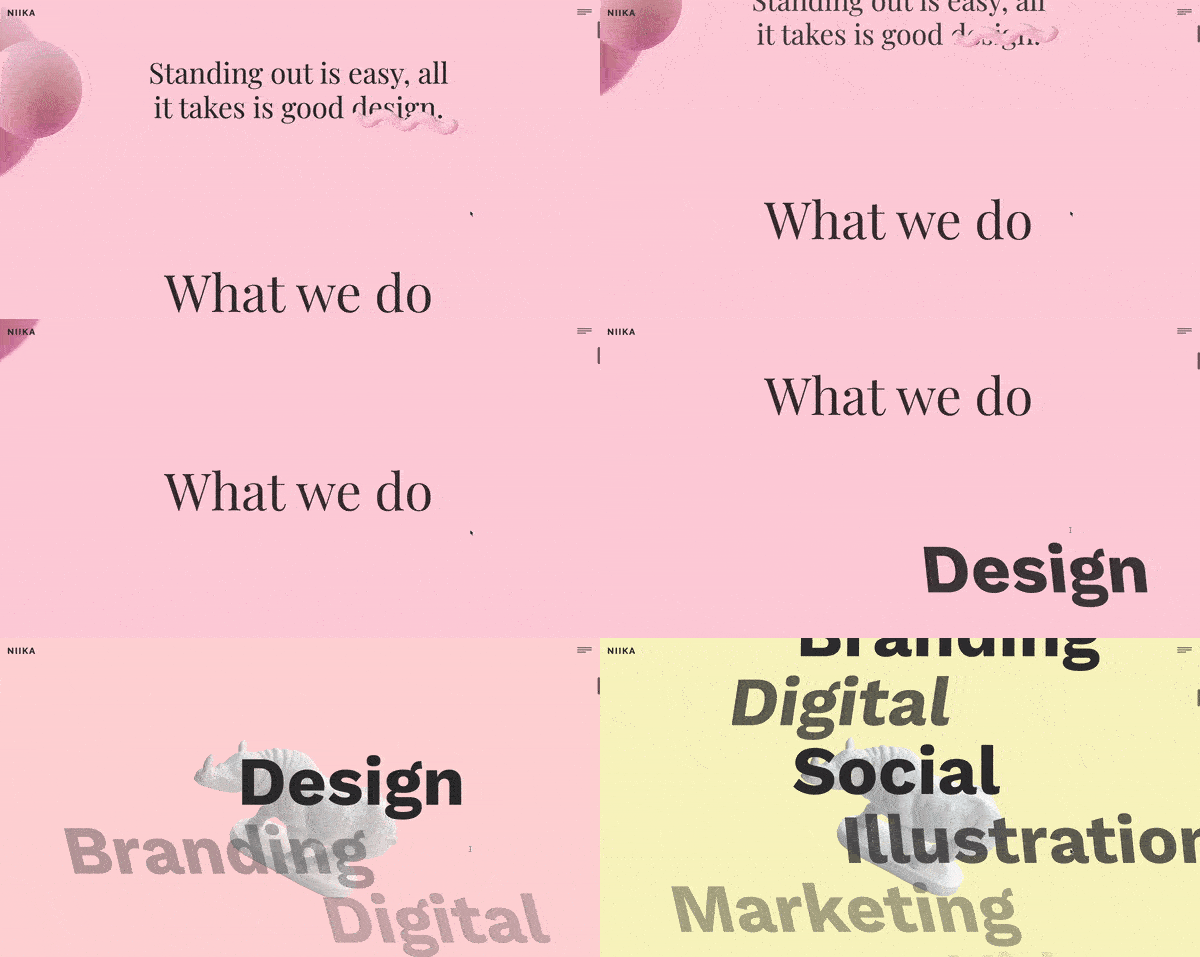
Niika’s mix of animation with the use of parallax scrolling creates an entrancing effect against a bright pink background. What’s most notable about this example is the use of diagonal animation under “What we do,” making the subheadings crisscross over each other as I scroll. This clever design makes it impossible to miss what the agency might do for me.
I love Niika’s example because it shows that parallax scrolling doesn’t necessarily have to be horizontal, vertical, or perspective-based. You can create an engaging effect by making the headings and the images move diagonally, too. But it’s important to note that this would work on only the most important part of your webpage. If you use it on all elements, it can become overwhelming very quickly.
Takeaways
- Apply the parallax effects on text and headings — not just images.
- Use diagonal parallax effects to wow the viewer and highlight a certain section of the page.
- Balance the parallax effects with blank space to give users a breather.
You can find more mesmerizing parallax scrolling examples here.
Parallax Scrolling Best Practices
Parallax scrolling effect is a great way to engage website visitors. But, when used wrong way, it may be distracting deter. Based on my experience, here are some best practices for developers looking to implement parallax scrolling effectively.
Use parallax to enhance, not distract.
From my experience, the best parallax effects subtly guide the user’s eye rather than overwhelm them. I’ve worked on designs where too much movement made navigation confusing. Instead, I focus on using parallax to highlight key sections without making users struggle to find important information.
Ensure mobile compatibility.
Parallax effects don’t always translate well to mobile devices. We saw that in the first method we used to create a parallax scrolling effect where the background-attachment:fixed; works perfectly on desktop but not mobile view. This goes to show how important compatibility testing is.
Always make sure to test responsiveness and consider alternative layouts or scaled-down effects for smaller screens.
Maintain readability and accessibility
One of the biggest mistakes I’ve seen (and learned from) is adding excessive layering or movement that makes text difficult to read. When elements move too quickly or overlap unpredictably, visitors may struggle to process key information, which defeats the purpose of using this effect in the first place.
To prevent this, I use low-contrast color combinations, especially when the background is in motion.
Layer Elements Thoughtfully
One trick I always use is adding multiple layers to create depth rather than just moving the background and foreground. In past projects, I found that carefully shaded and arranged layers make the effect feel more immersive without looking artificial.
Pair parallax with strong typography.
I’ve seen parallax scrolling shine when paired with bold, readable typography. If the effect makes text hard to read, it defeats the purpose. I always test different font sizes and colors to ensure legibility while maintaining a dynamic visual experience.
How to Get the Best Out of Parallax Scrolling
Now that you have an idea of how to write a parallax scrolling script with CSS, you can start experimenting with all the design possibilities on your website. Ideally, you'll experiment on a staging site before pushing this code to your live website.
When thinking about how to design your website to take full advantage of parallax scrolling, don't forget to tell a story, make it engaging, and include a call-to-action.
Also, don't just use parallax just for the sake of using it! Parallax scrolling is an awesome tool to boost engagement, but it must be used tactfully for optimal impact.
Editor's note: This post was originally published in February 2020 and has been updated for comprehensiveness.

Free Guide: 25 HTML & CSS Coding Hacks
Tangible tips and coding templates from experts to help you code better and faster.
- Coding to Convention
- Being Browser-Friendly
- Minimizing Bugs
- Optimizing Performance
Download Free
All fields are required.

You're all set!
Click this link to access this resource at any time.
User Experience


![How to become a UX designer, a step-by-step guide [expert tips]](https://53.fs1.hubspotusercontent-na1.net/hubfs/53/become-a-ux-designer-1-20240731-321437.webp)


![20 UX Design Examples Hand-Picked by Experts [With Analysis]](https://53.fs1.hubspotusercontent-na1.net/hubfs/53/ux-design-examples-1-20250404-8425368.webp)


